
Launching the Indian American Voter Atlas
There are 5.4 million Indian Americans in this country. 2.6 million of us are eligible to vote. We're the highest-income ethnic group in the United States, and we're concentrated in some of the most competitive congressional districts in the country. In 2024, Indian Americans had one of the most dramatic partisan shifts of any demographic group in American politics.
But if you're a journalist writing about the Indian American vote, a candidate trying to understand the community in your district, or an Indian American who just wants to see where we stand, there is no single place to go. The data is scattered across Census tables, bureaucratic databases, and academic surveys. Political polling buries us among Asian Americans. This dashboard is a synthesis of all of those sources into something useful.
That's what the Indian American Voter Atlas does. It's the first nonpartisan, civic data dashboard built specifically for the Indian American community.
I built it because nobody else would.
Who This Is For
This dashboard serves four audiences, and I deliberately designed it to be useful to all of them simultaneously.
Hill staffers and policymakers. I've spent years working on and off Capitol Hill. I can tell you from firsthand experience that congressional offices make decisions based on what data is in front of them. If a staffer can't quickly look up how many Indian Americans live in their boss's district, what their top policy concerns are, and whether the community is growing, then Indian Americans don't factor into the calculus. This dashboard puts that data one click away. No login, no paywall, no party affiliation required.
Journalists and researchers. There is a serious lack of interest in the Indian American community, whether because of the model minority myth or because we're not a vocal and loud group with elite access, despite our success. Journalists' narratives about Indian Americans are frequently colored by biased reporting on India, and not on the actual diaspora. The Atlas gives reporters access to the same primary sources — Carnegie IAAS surveys, Census ACS data, DOL immigration filings, FBI hate crime statistics, precinct-level returns — organized so they can tell a more complete and honest story.
Indian American civic organizations and PACs. Whether you're deciding which state legislative races to invest in, trying to understand where the community is most politically active, or building the case for why Indian Americans matter in a given district, this is your intelligence layer. The Persuasion Index, which I'll explain in the methodology section below, goes beyond simple Census headcounts to measure where Indian Americans are not just living but civically and economically active, and where they have the most electoral leverage. When you go to Congress for advocacy and lobbying, you can point to this database as a source of truth.
Indian Americans ourselves. We deserve to see our own data. The 2024 election revealed that our community is far more ideologically diverse than either party assumed. The Atlas presents that reality without editorializing on its meaning. You can draw your own conclusions.
What the Dashboard Shows Today
The Atlas is a live, database-backed dashboard with an interactive map and eight data layers. It's mobile-responsive and free at voteratlas.io.
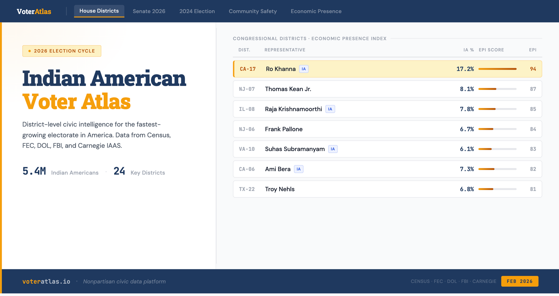
House Districts maps Indian American population, percentage, and economic presence across twenty-four key congressional districts — from CA-17 in Silicon Valley (132,000 Indian Americans, the largest concentration in any single district) to competitive swing seats like NJ-07 and TX-22 where our community could be decisive. The district selection uses a dual rubric: raw population density and political prominence. That's why you'll find members like Eric Swalwell (CA-14, Intel Committee, fast-growing Dublin/Tri-Valley corridor), Josh Gottheimer (NJ-05, Problem Solvers Caucus co-chair, Bergen County's major Indian corridor), Jamie Raskin (MD-08, ranking member of Oversight, Montgomery County), and Brad Sherman (CA-32, India Caucus co-chair) alongside the highest-population districts. A member who sits on a key committee or co-chairs the India Caucus matters to the community even if their district ranks 25th by headcount. Each district card includes the current representative, Cook Political Report competitiveness rating, our proprietary Persuasion Index score, Economic Presence Index score, and an interactive map with three color modes: Persuasion Index heat, Economic Presence, and political competitiveness.
Senate 2026 covers the 15 most relevant Senate races for the upcoming cycle, including Indian American populations by state, FEC donor data by state, and competitiveness ratings. Texas, with 430,000 Indian Americans, and New Jersey, with 380,000, are the headline races.
The 2024 Election section is the most data-dense. It presents the full presidential vote trend from 2004 through 2024; a gender-age breakdown that highlights a 22-point swing among young Indian American men toward Trump; party identification shifts showing Democrats down nine points while Independents gained eleven; top policy issues from the Carnegie survey; and precinct-level swing data from six Indian American enclaves, including Edison, New Jersey, which swung roughly 50 points rightward before snapping back in the 2025 governor's race. I also include an analytical section on what drove this shift and the evidence for a potential bounceback for the 2026 Election cycle.
Then, in a clearly separated section: the IAAS 2026 findings.
In January 2026, Carnegie released the first wave of Indian American survey data since Trump's second term began: 1,000 respondents, fielded from November through January, with a ±3.6% margin of error. This is job approval data, and it tells a different and important story. Only 29% of Indian Americans approve of Trump's job performance in his first year back. Fifty-five percent express strong disapproval. On the specific question of US-India relations: an issue you might expect to generate goodwill given Modi's relationship with Trump, only 20% approve of Trump's handling, down from 48% who approved Biden's. The community that shifted rightward in 2024 has not converted that shift into approval of the administration's performance.
The racial comparison is striking: Indian American approval (28%) tracks almost identically to Hispanic approval (30%), and sits 20 points below white approval (48%).
Indian Americans are not behaving like an economically elite immigrant group that has assimilated into the Republican coalition. They are behaving like a minority community with minority-community concerns.
The dealignment continues, but in an unexpected way. Democratic identification has fallen to 46%, down from 52% in 2020, and Republican identification has slipped from its 2024 peak of 21% to 19%. All the gains have gone to independents, now at 29%, up from 15% in 2020.
The community is not moving right; it is moving away from both parties.
Economic Presence consolidates nine federal datasets tracking where Indian Americans are economically rooted — from immigration pipeline data (DOL PERM, USCIS Yearbook) to mortgage originations (CFPB HMDA, 2018–2024), business ownership (Census Annual Business Survey, SBA 7(a) and 504 loans), political contributions (FEC, 9 election cycles, 2008–2024), and federally-funded research (NIH Reporter and NSF Award Search, FY2008–2023). The tab is organized into five sub-sections — Immigration Pipeline, Household Wealth, Business Ownership, Research & Innovation, and Political Economy — each with a methodology badge distinguishing exact federal classifications from surname-based estimates. Together these datasets document not just how much the community earns, but where it invests, lends, builds businesses, funds science, and participates in democracy.
The Economic Presence Index — the primary score on each district card — is a weighted composite of these five data layers. Districts missing coverage for a given component are scored on available indicators only, with weights renormalized and coverage documented transparently on each card.
Immigration Pipeline is a dedicated sub-section, and it exists for a reason I want to be direct about. The H-1B visa and employment-based green card backlog is the single most politically consequential issue for a large segment of our community. Hundreds of thousands of Indian-born workers and their families are stuck in a green card line that stretches for decades. These are people playing by the rules, paying taxes, raising American children, who have no resolution in sight.
This data has historically been weaponized against us: anti-immigration groups pull PERM disclosure files and use them to argue that Indian workers are "replacing" Americans. I built this tab so that the community and its allies have the same data, presented in context. Every district card shows how many PERM labor certifications (the first step of the green card process) were filed in that state, the average offered salary, and the top employers. When someone at a city council meeting claims Indian workers are "draining our pockets," the response should be immediate and empirical: these are workers earning $120,000+ at companies like Microsoft, Google, and major hospital systems, contributing an estimated $250–300 billion in annual tax revenue. For those who want to debate policy and not fling ragebait, these are the numbers.
Household Wealth draws from CFPB HMDA mortgage origination data (2018–2024, exact race code 21) and Census ACS homeownership data, covering 8 of our 24 tracked districts. For those districts, it documents origination counts, average loan amounts, approval rates, and purchase-versus-refinance breakdowns.
Business Ownership combines Census Annual Business Survey employer firm data (2023, Asian-owned firms) with SBA 7(a) and 504 loan data matched to Indian-origin business owners using surname methodology. Both data sources are labeled with appropriate methodology badges — the ABS reflects Asian alone (all ethnicities), and the SBA figures are surname-based floor estimates.
Research & Innovation integrates NIH Reporter and NSF Award Search data covering FY2008–2023. Across 11 states, 3,768 NIH awards and 1,990 NSF awards were matched to Indian-origin principal investigators, representing $2.0B in NIH funding and $912M in NSF funding. The section leads with people, not dollars: 5,758 Indian-origin scientists funded by the federal government since 2008.
Political Economy presents FEC individual contribution data across 9 election cycles (2008–2024), matched to Indian-origin donors using validated South Asian surname methodology following Karthick Ramakrishnan's approach at AAPI Data. The section shows cycle-by-cycle giving trends, geographic distribution, and total donor activity.
Community Safety tracks hate crimes and bias incidents affecting Indian Americans through multiple sources: FBI UCR data, the Sikh Coalition, CoHNA, Stop AAPI Hate, the Hindu American Foundation, and state-level reporting. It includes an FBI trend chart tracking anti-Asian, anti-Sikh, and anti-Hindu incidents over a decade, plus a documented incident log of temple attacks and mass violence going back to the Oak Creek gurdwara massacre in 2012. The section leads with a critical caveat: the FBI captures approximately five percent of actual hate crime victimizations. If we don't name the data gap, we're being dishonest about the data we do have.
Discourse Monitor tracks documented events — legislation, policy changes, incidents, rhetoric, advocacy — organized chronologically with type classification and directional valence. The Narrative Tracker identifies recurring themes: H-1B crackdown anxiety, tariff impacts on small businesses in the Edison corridor, anti-Indian sentiment from segments of the MAGA base, caste legislation backlash, temple security fears, and the broader political dealignment conversation among younger community members. Each narrative is tagged with intensity, platform spread, directional trend, and sample framing.
Bill Tracker monitors federal legislation relevant to the community — immigration reform, H-1B policy, hate crimes legislation, India relations — pulled directly from Congress.gov's API.
Methodology documents every data source, weighting decision, and known limitation. If you don't publish your methodology, you're asking people to trust you. I'd rather show my work and let people decide for themselves.
A Note on Population Data
Our population figures for Indian Americans in each district are higher than those in the Census Bureau's American Community Survey table B02015. This is intentional, and I want to explain why.
The Census asks respondents to check a box for "Asian Indian." Table B02015 counts only people who check that box and no other racial category. This "alone" count is a floor, not a ceiling. It misses multiracial Indian Americans. It misses respondents who identify as "South Asian" or "Indo-Caribbean" without checking the specific "Asian Indian" box.
Our figures incorporate community-level estimates from organizations that specialize in this population — AAPI Data, SAALT, and state-specific community organizations. These estimates use the Census "alone" count as a baseline and apply correction factors for multiracial identification, non-response, and known undercount patterns.
To be transparent: we built a verification tool into our admin system that shows the Census "alone" number next to our estimate for every district. In some districts, the gap is small. In others — like NJ-07, where we report 62,000 and Census B02015 shows 16,000 — the gap is large. That gap reflects the difference between asking "how many people checked one specific box on a government form" and asking "how many people of Indian origin actually live here." Both are valid questions. We've chosen the one that better serves a civic tool designed to represent the community as it actually exists. If you prefer the Census "alone" number, it's in our database too.
What This Could Become
The current dashboard is a fully functional live product backed by a Supabase database. But the architecture is designed to grow.
State legislative expansion. Mapping the Indian American population to state senate and assembly districts in six to eight key states. This is where the real value is for PACs and candidates — nobody has this data, and state legislative races are where community-level political power actually gets built.
Original survey research. The Carnegie IAAS 2026 (n=1,000) is the most current snapshot of Indian American opinion and is now integrated into the Atlas. But even with 1,000 respondents, it cannot reliably disaggregate by state, religion, or immigration generation. A commissioned survey with 1,500 validated voters would answer questions the Carnegie data can't: Do Hindu and Sikh Indian Americans have meaningfully different approval ratings? Do the 2026 findings hold specifically in competitive districts like NJ-07 and TX-24? What's driving the continuing dealignment toward Independent identification? A survey like this would make the Atlas the primary citation, not just the best aggregator.
Community incident reporting. A structured system where community organizations — gurdwaras, temples, mosques, civic associations — can submit bias incidents directly to the dashboard with institutional credibility and verification chains. This would address the massive underreporting problem in a way that individual FBI reporting can't.
District-level economic data coverage. The Economic Presence Index currently scores districts on up to five components depending on data availability. HMDA mortgage data covers 8 of 24 tracked districts; NIH and NSF grant data is available at the state level and applied as a proportional proxy to districts within each state. The next phase of data work will supplement district-level gaps with validated state-level proxies — using the same proportional allocation methodology currently applied to DOL PERM data — until district-level federal datasets expand their coverage. Every score on the platform documents which indicators contributed to it, so the methodology is transparent even when coverage is incomplete.
Automated data pipelines. Right now, I manually update the dashboard data. For Year 1, that's fine. But the long-term architecture calls for automated pipelines pulling from the Census API, FEC bulk data, and Google Trends, with a CMS interface for editorial content like discourse events and narrative tracking.
The vision is a platform synthesized into a single product, nonpartisan by design, and free at the public layer.
Why Now
I'll be direct about the timing.
In February 2026, the New York Times published a piece titled "How the Visa Debate for Foreign Workers Fuels Racism Against South Asians." The article documented what many of us have been watching unfold: a legitimate policy debate about H-1B visas has been hijacked by replacement-theory rhetoric targeting Indian Americans specifically. City council meetings in Frisco, Texas have featured speakers calling for "maintaining our Rhodesia." A sitting Florida city councilman called for the mass deportation of Indians. A candidate for Texas attorney general wrote that Texas counties "may soon be renamed Calcutta, Delhi & Hyderabad." Anti-Indian posts on X garnered 280 million views in two months. Nearly 80% of anti-Asian slurs online are now directed at Indians.
This isn't abstract for me, and it probably isn't abstract for you either.
The same month, Carnegie's survey found that 72% of Indian Americans disapprove of Trump's job performance and only 20% approve of his handling of US-India relations. The community has clear views. What it has lacked is a single, credible, nonpartisan place to see those views presented alongside the demographic data, the economic data, the safety data, and the electoral leverage analysis.
The Indian American residents who showed up to that Frisco city council meeting made exactly the argument this dashboard makes: we're here legally, we contribute, we're part of this community, and part of America's fabric.
That's what this project is. The next time a mayor needs to push back on replacement-theory rhetoric about Indian Americans in his city, he should be able to pull up voteratlas.io on his phone and show them the data: the tax contributions, the employment numbers, the salary figures, the civic engagement, the hate crime trends, and the survey evidence that this community is watching, is engaged, and is not going anywhere.
Data doesn't win arguments by itself. But it makes arguments much harder to win against.
Methodology
Transparency about methodology is non-negotiable. If you can't explain how you got your numbers, they're just opinions.
Persuasion Index
The headline metric in the Atlas is the Persuasion Index: a composite score from 0 to 100 that measures not just where Indian Americans live but where they have the most electoral leverage. A high Persuasion Index indicates that a district combines a meaningful Indian American population with competitive elections, where a motivated community can genuinely influence outcomes.
The top five districts by Persuasion Index: NJ-07 (93) is competitive at R+1 with 62,000 Indian Americans. NY-04 (88) has an even PVI, 30,000 Indians, and swung 6 points rightward in 2024. TX-24 (79) is only R+5, with 42,000 Indians in Irving and Dallas. Compare these to CA-17, which tops the Community Density Index at 94 but scores only 42 on Persuasion — because there's no race to influence in a D+30 district. Density tells you where the community is. Persuasion tells you where the community matters electorally.
The Persuasion Index is a weighted composite of five factors:
District Competitiveness (30%). Cook PVI and 2026 race rating. Toss Up and Lean districts score highest. Solid D and Solid R districts score low regardless of how many Indian Americans live there.
2020→2024 Swing Magnitude (25%). Precinct-level data from Indian American enclaves showing how much the community shifted between elections. Districts with demonstrated volatility score higher. Edison, NJ swung roughly 50 points rightward in 2024 before snapping back in 2025. That volatility is the definition of persuadable.
Independent Identification Rate (20%). District-level proxy derived from Carnegie IAAS party identification data. The 14-point national surge in Indian American Independent identification — from 15% in 2020 to 29% in 2026 — varies by region. Districts in metros showing stronger dealignment signals score higher.
Indian American Population Size (15%). Absolute number of Indian American eligible voters. A high persuasion score in a district with 2,000 Indian Americans is less actionable than a moderate score in a district with 60,000.
Bounceback Evidence (10%). Where available, 2025 off-cycle election data showing whether the 2024 rightward shift held or reverted. Districts showing bounceback receive higher persuasion scores because the electorate is actively in motion.
Economic Presence Index
The Economic Presence Index is the primary score shown on each district card. It is a weighted composite of up to five components that measure where Indian Americans are economically and civically rooted, not just where they live.
FEC donor activity (30%). Donor-to-population ratio across 9 election cycles (2008–2024), using validated South Asian surname methodology following Karthick Ramakrishnan's approach at AAPI Data. A rising cycle-over-cycle trend in donor activity scores higher than a flat or declining one.
HMDA mortgage originations (25%). CFPB Home Mortgage Disclosure Act data using exact race code 21 (Asian Indian), tracking originations, loan amounts, and approval rates by district. Currently covers 8 of 24 tracked districts. This is a high-precision federal classification — not a surname estimate — and carries the most methodological weight per dollar in the index.
Business ownership (20%). Census Annual Business Survey employer firm data (2023) and ACS economic indicators, both using exact federal race classifications. The ABS reflects "Asian alone" (all Asian ethnicities), which overstates the Indian American count; this is documented with an appropriate methodology badge on the dashboard.
NIH/NSF grant activity (15%). State-level federal research grant data matched to Indian-origin principal investigators using surname methodology, applied proportionally to districts within each state. Covers FY2008–2023: 3,768 NIH awards ($2.0B) and 1,990 NSF awards ($912M) matched to Indian-origin researchers.
SBA loan volume (10%). Small Business Administration 7(a) and 504 loan data matched using surname methodology. Because surname matching applies to business names rather than owner names, this figure significantly undercounts sole proprietors and partnerships operating under non-Indian trade names. It is a floor estimate.
Districts missing data for a given component are scored on available components only, with weights renormalized to sum to 100%. A coverage indicator on each district card shows how many of the five components contributed to that district's score.
Community Density Index
The Community Density Index is a companion metric — shown in the district detail view and on the methodology tab — that measures not just where Indian Americans live but also where they are civically and economically present. It is a weighted composite of five data sources:
Census ACS Data (40%). Asian Indian population from ACS 5-Year Estimates, adjusted using community-level estimates, mapped to 119th congressional district boundaries.
FEC Donor Surname Analysis (20%). Individual contribution data filtered using validated South Asian surname lists, following Karthick Ramakrishnan's methodology at AAPI Data.
Cultural Business Density (20%). OpenStreetMap data on Hindu temples and Sikh gurdwaras per district, verified through our Overpass API data loader mapping approximately 490 places of worship nationwide using haversine distance calculations.
Google Trends Proxy (15%). DMA-level search interest for culturally specific terms: Diwali, Indian grocery, H-1B visa, cricket score. Captures digital engagement in areas where Census data lags behind actual community growth.
USCIS H-1B Data (5%). H-1B employer location data as a proxy for recent immigration clusters. Indian nationals received approximately 72% of all H-1B visas in 2024. Low weight because H-1B holders aren't necessarily permanent residents or voters, but they signal where the community is heading.
Data Sources
Population & Demographics: Census ACS 5-Year Estimates (Tables B02015, C16001, B16004), supplemented by AAPI Data and SAALT community estimates.
Immigration & Economy: Department of Labor PERM Disclosure Data (FY2008–FY2024); CFPB HMDA (2018–2024, race code 21, exact); Census Annual Business Survey (2023, exact race classification); USCIS Yearbook of Immigration Statistics (2001–2023, country of birth, exact); NIH Reporter (FY2008–2023, surname estimate); NSF Award Search (FY2008–2023, surname estimate); SBA 7(a) and 504 loan data (1991–present, surname estimate); Census ACS income, poverty, labor force, and educational attainment data.
Electoral: Carnegie Endowment IAAS survey data (2020, 2024, 2026), precinct-level returns from six Indian American enclaves, Cook Political Report competitiveness ratings, FEC individual contribution data (9 cycles, 2008–2024, surname estimate).
Community Safety: FBI Uniform Crime Reporting hate crime statistics, Sikh Coalition incident database, CoHNA incident reports, Stop AAPI Hate monitoring data, Hindu American Foundation reporting, Center for the Study of Organized Hate online extremism tracking.
Legislation: Congress.gov API for bill tracking, filtered by relevance to immigration, H-1B, hate crimes, India relations, and civil rights.
Cultural Infrastructure: OpenStreetMap Overpass API for Hindu temple and Sikh gurdwara locations, mapped to congressional districts using haversine distance calculations.
Economic dataset coverage by table:
Known Limitations
The Census ACS 5-Year Estimates lag by 18–24 months. The "Asian Indian alone" category misses multiracial Indian Americans and may undercount undocumented community members. Congressional district boundaries were redrawn after the 2020 Census, so pre-2022 comparisons require careful crosswalking.
Surname matching for FEC, SBA, NIH, and NSF data is inherently imprecise. It will miss Indian Americans with non-South-Asian surnames (married names, anglicized names) and may incorrectly include non-Indian South Asians. The approach is standard in the academic literature, but it produces estimates, not exact counts. Each dataset using this method is labeled with a "Surname estimate (~90% precision)" badge on the dashboard.
HMDA mortgage data currently covers 8 of 24 tracked districts due to volume thresholds in federal reporting requirements. Districts without HMDA data are scored on remaining Economic Presence Index components only, with weights renormalized.
The Annual Business Survey reports "Asian alone" employer firms rather than "Asian Indian alone," which overstates the Indian American-specific count. This is noted on the dashboard with an appropriate methodology badge.
SBA surname matching applies to the business name field rather than owner name, which significantly undercounts sole proprietors and partnerships operating under non-Indian trade names. The SBA figures are floor estimates.
NIH and NSF grant data is available at state level only. District-level figures are proportional estimates using Indian American population share within each state — the same proportional allocation methodology applied to DOL PERM data.
The Carnegie IAAS 2024 wave (n=714) is sufficient for national toplines but too small to disaggregate reliably by state or district. The 2026 wave (n=1,000, ±3.6%) improves on this margin but remains a national instrument. Both are pre- or between-election surveys, not post-election validated voter studies. Precinct-level swing data is inferential — it measures shifts in heavily Indian American precincts, not verified individual vote choice.
FBI hate crime statistics capture roughly five percent of actual hate crime victimizations. State and local reporting is inconsistent. Sikhs are frequently targeted under anti-Muslim animus, creating a misclassification problem that compounds the undercount. The Narrative Tracker relies on manual monitoring of public platforms and does not access private communications. Intensity ratings are editorial assessments based on cross-platform spread, not quantitative engagement metrics.
A Note on Nonpartisanship
This dashboard does not endorse candidates, recommend votes, or advocate for policy positions. It presents data. The 2024 Election tab shows that Indian Americans shifted to the right. It doesn't argue whether that's good or bad. The IAAS 2026 section shows that Indian Americans broadly disapprove of Trump's performance; it doesn't predict what that means for 2026 or beyond. The Community Safety tab documents hate crimes; it doesn't assign collective blame. The Discourse Monitor tracks both supportive and hostile events — it doesn't filter in one direction. The Persuasion Index tells you where Indian American voters are gettable; it doesn't tell you which party should get them.
This is a deliberate design choice, not an absence of conviction. Nonpartisan data tools serve everyone. The moment this product advocates for a party or position, it becomes useful to half the audience and suspect to the other half. I'd rather build something that a Democratic PAC and a Republican campaign committee can both use, because that means the data is being taken seriously by the people who make decisions.
The Indian American Voter Atlas is live at voteratlas.io. The dashboard is free, the methodology is public, and the data is updated on a regular cycle. If you're a journalist, researcher, civic organization, or community member who wants to use this data, it's yours.
If you're interested in supporting the expansion of this project — particularly the state legislative dataset and original survey research — reach out.
Published by Anang Mittal
Member discussion